A big Leap..
The past few days have been a big leap for me. Thanks to Google's search engine, tons of prolific writers across the world, and Tanvi Chanchalani, I learnt something about wordpress and css, which enabled me to modify a beautifully aesthetic 2-column wordpress theme called Lotus Flower into a 3-column wordpress theme. Not only this, using it, I was able to quickly make two websites on my newly purchased domain, wisdomspeak.org.
The purpose of this post is to recount my learning experience in slow motion for my own benefit and also for the benefit of those thousands of budding wordpress theme creators. Honestly, there is so much creativity out there. People get great ideas all the time. It would be a pity not to be of any service to them, so that they could help humanity. Well, seriously, I just want to help.
I Love you!.. but...
Ok, back to the mission.
When I initially saw the Lotus Flower theme on http://www.freewpthemes.net, I was so impressed (bowled over might be the right term) that it immediately struck me "the" one. And I used it very well, feeling happy.
But soon, I realized that to encourage the community to adopt the audio resources website that I was planning to build, Im going to need people to donate as well, which meant that they needed to see the Donate through Paypal plugin on the sidebar WITHOUT scrolling down.
Necessity is the mother of Invention..
The Support us plugin simply had to catch the attention of the person browsing the website, or else the idea would be buried in the annals of .. uhm.. the sidebar. So I had this really urging need of bringing it on the right hand side, along with some more visible links to related websites. Cmon now, I had to make it easy on the users, right, or else I wouldn't be doing my marketing homework right.
And so, i started looking around for means to add another sidebar. But there was this ONE problem. I didn't know squat about PHP or wordpress themes or CSS !
Hmm, but I had a couple of big factor on my side. I had the fire in the belly to make it work and I had TIME. Did anyone tell you that time is also a big resource? (The Capitalist says: Time is Money. In Hindi they say, समय बड़ा बलवान - time is very powerful).
And so, the hunt begins..
Ok, so the first thing to understand for customizing a wordpress theme is that the heart of the Look/Feel/User Interface is the style.css (cascading style sheet) file, which is usually in the home directory of the Wordpress theme ($WORDPRESS_HOME/wp-content/themes/<themename>). The directives given in style.css regulate the placement and cosmetics of the elements that make up the website.
The contents or elements themselves come from Wordpress's infrastructure (content entered through .../wp-admin.php console) and have got nothing to do with a style.css file. You could simply modify the sytle.css and achieve visually very different results. For example, check out wisdomspeak.org/vedictalks and wisdomspeak.org/mantra. They are both using the SAME theme, but just slightly different style.css etc.
A different path of hit and trial..
But thats not how it played out for me. The paragraph above me is just me talking in retrospect.
First, I tried adding a second sidebar to the Lotus Flower theme. After googling a lot of pages, I could finally see sidebar2 in the Configure Widgets Page (through the Dashboard link):
1) Prefixed an argument "2," as the first argument to the register_sidebars() function in functions.php. Earlier, the function call was for register_sidebar() -- notice the singular case.
register_sidebars(2, array(
'before_widget' => '<li id="%1$s" class="widget %2$s">',
'after_widget' =>  '</li>',
'before_title' => '<h2 class="widgettitle">',
'after_title' => '</h2>',
));
2) Copied $WORDPRESS_HOME/wp-content/themes/<themename>/sidebar.php to $WORDPRESS_HOME/wp-content/themes/<themename>/sidebar2.php and made the following changes in sidebar.php and sidebar2.php:
# diff sidebar.php sidebar2.php
1c1
< <div id="sidebar-left">
---
> <div id="sidebar-right">
3c3
<               <?php if (!function_exists('dynamic_sidebar')
|| !dynamic_sidebar(1)): ?>
---
>               <?php if (!function_exists('dynamic_sidebar')
|| !dynamic_sidebar(2)): ?>
Earlier, the function call inside sidebar.php was only for dynamic_sidebar(). It wasn't working without it. Also, the <div id..> tag value was made more specific to -left or -right.
Later on, I realized that the advantage of this was that I could influence the look and feel of each sidebar individually.
3) Included <?php include( "sidebar2.php"); ?> in page.php and index.php like this:
<?php get_header(); ?>
<?php include( "sidebar2.php"); ?>
Then did the same for $WORDPRESS_HOME/wp-content/themes/<themename>/404.php, archive.php, search.php, single.php. The really dumb rule of thumb that I followed was: if there is a <?php get_sidebar(); ?> in the php file, it needs the 2nd sidebar too. Common sense, eh?
4) At this point, lo and behold, I COULD see the 2nd sidebar in the Configured widgets page on Wordpress admin console and happily assigned the PayPal widget to the right sidebar. At least, I was getting somewhere.
5) When I tried previewing the website live, it WAS showing the right sidebar, but the left sidebar was pushed way down on the left. So the content was very much there, but the UI/cosmetics was not displaying it right. This is where we need to brush up our CSS skills.
learning basic CSS..
Now, it was down to manipulating the style.css for accommodating the extra sidebar.This is where these tutorials from html.net really helped me understand the overall scheme of css. I still don't understand that much about how floating works. My approach to making the theme work was .. change one property, preview it and if it wasn't working, revert it back. Pretty much hit and trial based.
From common sense, I could reason that there was a need to play with a lot of width values width/padding/marging values for various elements in style.css, because ultimately that's what was causing the mis-adjustment.
Changed the style.css a bit to accomodate the 2nd sidebar to the right. I had to play with a lot of width values. I just guessed that some of those width/padding/marging values were infuencing the display. But I didn't understand the overall structure properly yet.
It was actually at http://www.html.net/tutorials/css/lesson13.asp that a lightbulb lit up in my mind. The example had usedwidth: 33%;.
Ok, I thought, if this directive can be used for columns in a list, then why cant it be used for any other element? Or in other words, it should be possible to use a similar % directive for other elements in css too.
First blood..
This is where Tanvi helped me a lot in advising which sections and their properties to be changed. I wanted to cover more width on the screen (800x600 resolution is history). Keeping this in mind, she not only widened some settings, but also sent me widened images to go along with the new theme.
When I initially replaced the style.css for theme, its working on firefox, but not on IE: The left sidebar was not able to adjust on the top somehow, and was pushed down below. Also, the header and top navigation pane were not centered. Thats when I realized that the new widened images had not been overlaid. After copying them, the screen is much wider, finally! However, there seems to be some sort of an adjustment issue with the radio widget's size or floating adjustment for IE. From googling, it seems that there are some CSS bugs for IE, especially around wrapping or floating.
After playing with width: <number>% directives for content, sidebar-left, sidebar-right sections of style.css (I identified them with the background image tag -- compared the filenames to the theme's images visually.), I was able to bring all the contents under a very uniformly formatted pattern.
I was experimenting with % values for width on top of the css and this seems to be setting up the alignment very well for sidebars and the top! It almost like what is needed. But there was still a gap between the left sidebar and the main content box. It seems to be related to some margin setting for the content element. This is what worked out for me:
#sidebar-left {
        FLOAT: left; WIDTH: 20%
}
#sidebar-right {
        FLOAT: right; WIDTH: 20%
}
#content {
        BACKGROUND: url(images/img10.jpg) no-repeat left top;
 FLOAT: right ; WIDTH: 58%
}
In an effort to center and widen the header & logo and remove extra padding between header/logo, I kept playing with the properties of their sections:
#header {
        BACKGROUND: url(images/img02.jpg) no-repeat center center;
MARGIN: 0px auto; WIDTH: 1200px; HEIGHT: 60px
}
#logo-wrap
 {
       PADDING-RIGHT: 0px; PADDING-LEFT: 0px;
BACKGROUND: url(images/img03.jpg) no-repeat left top;
PADDING-BOTTOM: 20px; MARGIN: 0px auto;
WIDTH: 1200px; PADDING-TOP: 10px
}
Now the top alignment was perfect, but the menu links at the top (links to the Wordpress "Pages") were aligned to the very left. Once again, Tanvi came to the rescue and said that the answer was to change the left padding for menu UL section:
#menu UL {
    PADDING-RIGHT: 0px; PADDING-LEFT: 145px;
PADDING-BOTTOM: 0px; MARGIN:0px; LINE-HEIGHT: normal;
PADDING-TOP: 0px; LIST-STYLE-TYPE: none
}
This is when It was very much like what I wanted it to be. I was elated and thankful to have been able to achieve my goal.
Later that night, I saw that the padding for the elements in the right sidebar was off, not uniform. It was related to the left-padding pixel value being somewhat different for the list and element. I wouldn't say that even now all the left/right padding values for left/right sidebar's units/lists elements are uniform at 0px or 5px or 10px, but its just that the combination of hits and trial without a particular scheme worked out. You should take a more methodical approach and keep a uniform pixel side to make things easier.
The Modified theme ..
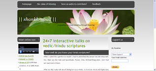
The theme is available here for your download and further modification. The original theme's zip file is available here.
Later on, I modified the following two things to make a different theme for wisdomspeak.org/vedictalks (the new one is style.css):
# diff style.css.gold1 style.css
2c2
<       PADDING-RIGHT: 0px; MARGIN-TOP: 10px; PADDING-LEFT: 0px; FONT-SIZE: 13px;
BACKGROUND: url(images/img01.jpg) repeat-x left top; PADDING-BOTTOM: 0px; COLOR: #333333;
PADDING-TOP: 0px; FONT-FAMILY: "Trebuchet MS", Arial, Helvetica, sans-serif
---
>       PADDING-RIGHT: 0px; MARGIN-TOP: 10px; PADDING-LEFT: 0px; FONT-SIZE: 13px;
BACKGROUND-COLOR: #FFF380; PADDING-BOTTOM: 0px; COLOR: #333333;
PADDING-TOP: 0px; FONT-FAMILY: "Trebuchet MS", Arial, Helvetica, sans-serif
98c98
<       BACKGROUND: url(images/img05.jpg) no-repeat left top;MARGIN-LEFT: 4px;
MARGIN: 0px auto; WIDTH: 950px; HEIGHT: 200px;
---
>       BACKGROUND: url(images/img05.jpg) no-repeat left top;MARGIN-LEFT: 4px;
MARGIN: 0px auto; WIDTH: 950px; HEIGHT: 20.3em;
The beauty of HEIGHT: <number>em property is that it can scale up the image very well.
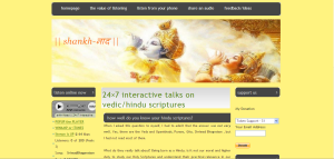
The new theme looks like this:
Feedback..
I know this is not the best of the tutorials out there on the internet, but I would appreciate feedback/validation from you, whatever your level of expertise. I am still learning CSS and would love to try new things like scalable flash images in a wordpress blog. So please leave a comment here. Thanks for your consideration.
